Wellcome: Helping researchers discover and secure funding
user research ui design ux strategy product management ux management
My role
I supported the Wellcome Web team initially as UX lead and later as product manager for ‘Research and Funding’ on wellcome.ac.uk.
The product vision was to provide an excellent digital service that helped researchers to find suitable funding opportunities, guide them along the application process and ultimately help them to manage their awarded grant.
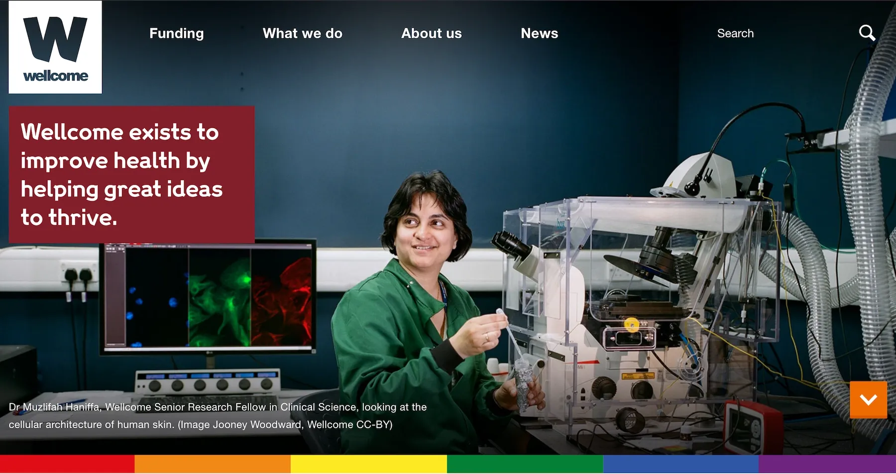
The Wellcome site had been re-designed and re-platformed shortly before I joined and a range of new features and projects were lined up to be tested and introduced. We launched new content to provide career guidance for researchers, a simplified and more intuitive tool to find suitable funding, a re-vamped help and support section, and an easy to browse directory of previously funded people and projects.
”It was an absolute pleasure to work with Ulf at The Wellcome Trust. He’s a top-notch UX designer, able to collaborate with other designers and non-designers to get to the best experience possible. He is calm, a voice of reason in the room, and through this brings clarity to tough decisions. I hope I get the chance to work with Ulf again.”
Process and methods
From kick-off to launch we followed a user-centred process that involved initial discovery (for example user story mapping or co-creative workshops) and regular fortnightly usability testing cycles.
The product team worked in scrum sprints framed by quarterly set Objectives and Key Results (OKRs) to prioritise work and measure progress and impact. This evidence-based approach to product management immensely helped to motivate the team, communicate our work with the wider organisation, and get work launched that helped to develop the product in the right direction.
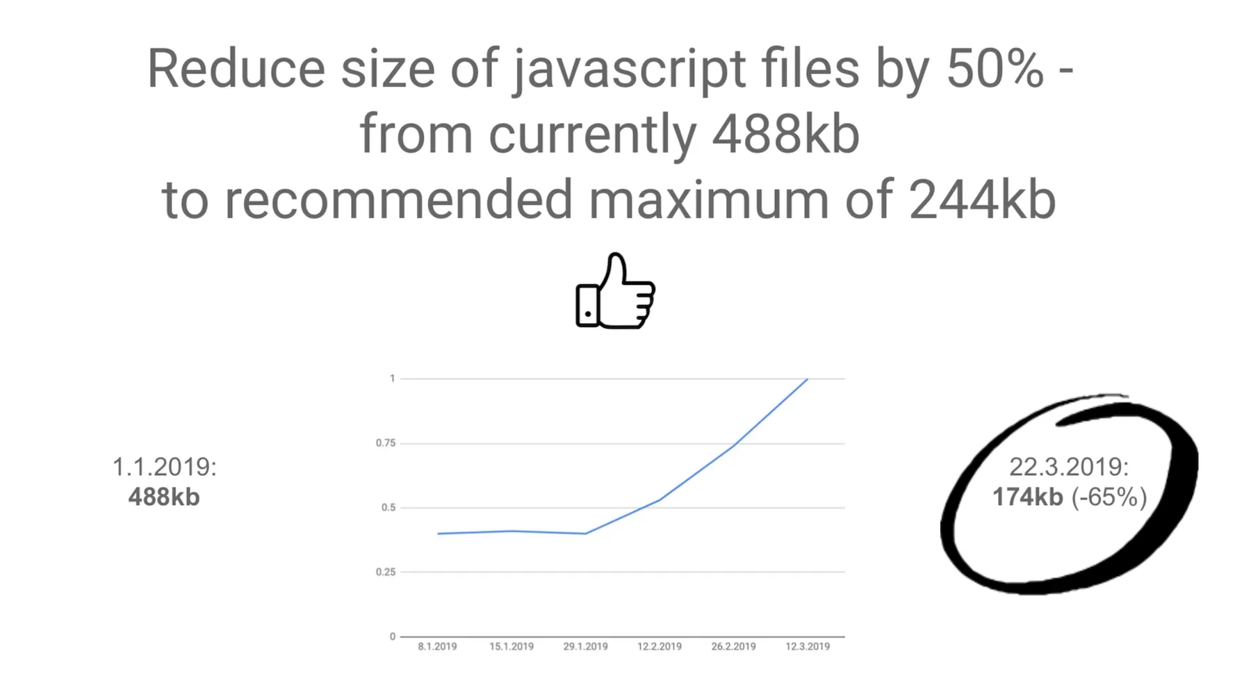
Generally, OKRs can address anything that brings a product closer to its vision and that improves the experience for the user, directly or indirectly. OKRs can also address the technical infrastructure. For example, one of our quarterly objective was to make it easier to develop wellcome.ac.uk and one of the related key results was to reduce the size of JavaScript files. This would help developers to maintain a clean code base. We would be able to release new content and features quicker to users. And it decreased page load time.
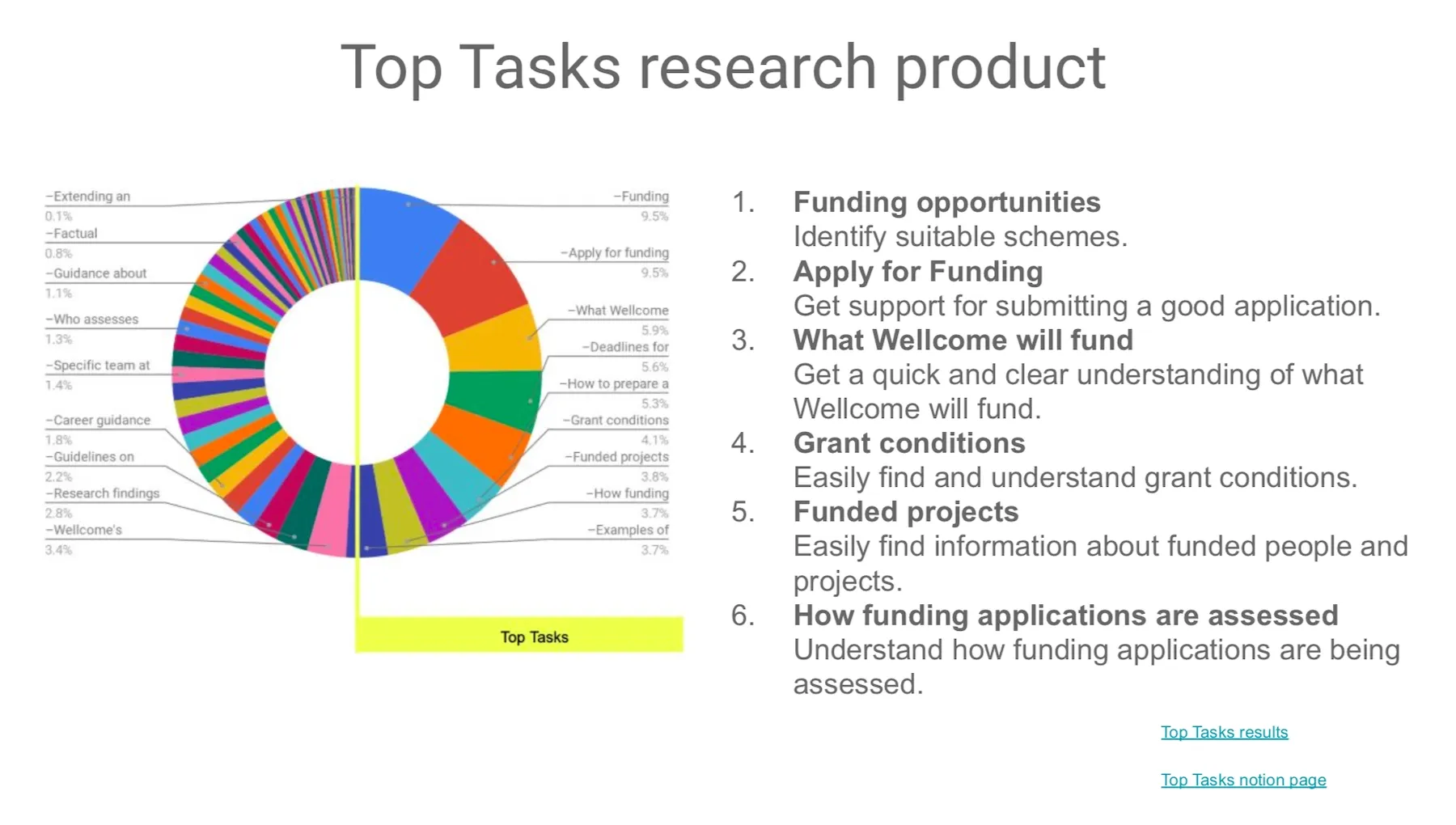
We also identified the Top Tasks of our product. Top Tasks is a tried and tested method to understand key needs of the audience in order of priority. It is essentially a voting exercise in which users indicate their five most wanted ‘tasks’ out of a long list of max. 100 items. We carried out this exercise with a sample of 400 site users and learned (not unsurprisingly!) that learning about funding opportunities and the application process were by far the most wanted tasks on wellcome.ac.uk
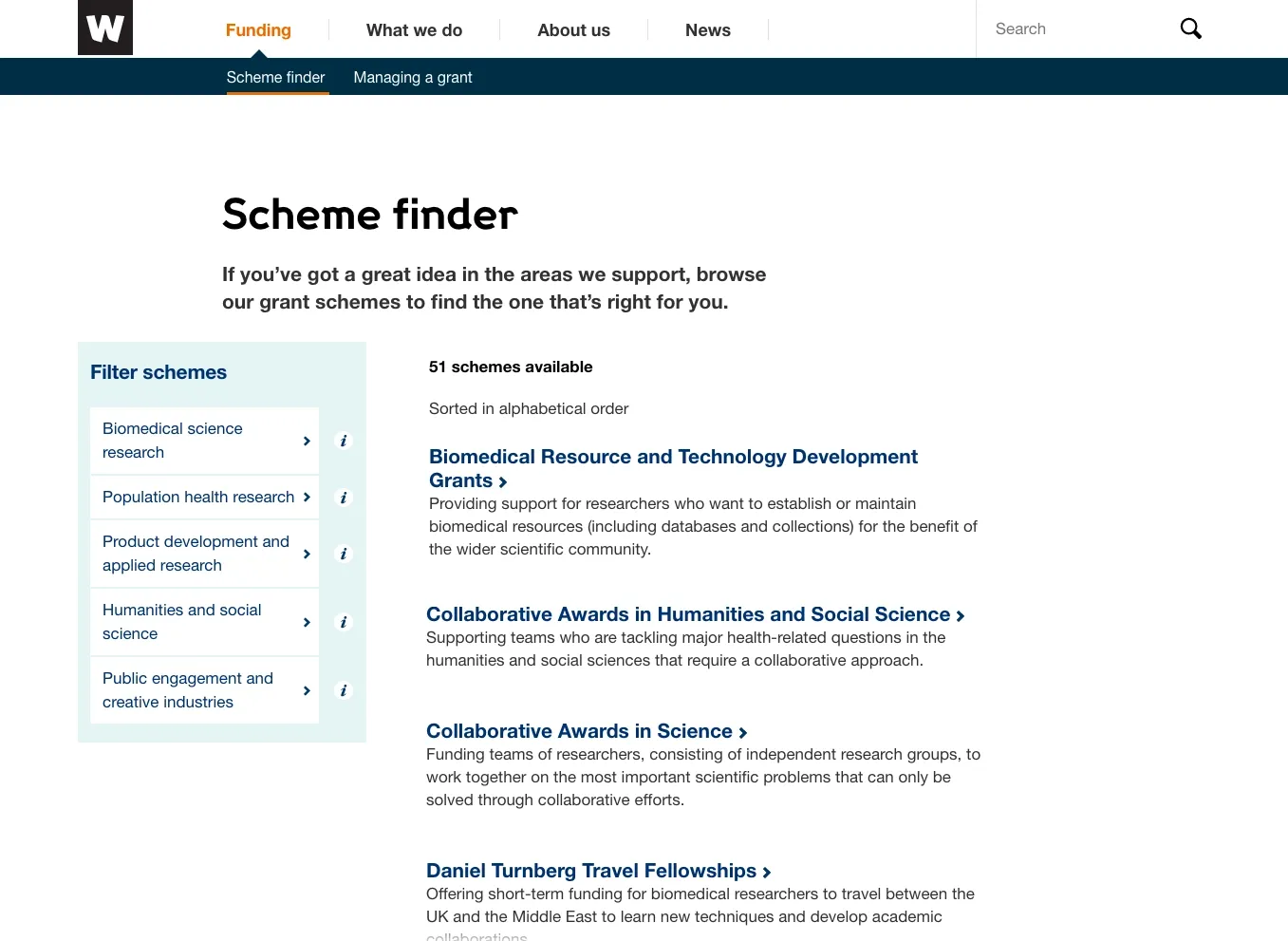
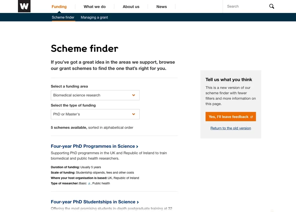
Targeting specific areas and features that users consider a Top Task with OKRs proved to be very successful. An example: By simplifying the listing page of funding opportunities (‘Scheme finder’) we increased the usage of search filters from an average of 30% to 70% of page views. In a further round of iteration, we decreased the average time users spent on this listing page by 20%.
Improving the scheme description page
The scheme finder and scheme description pages are top destinations on wellcome.ac.uk.
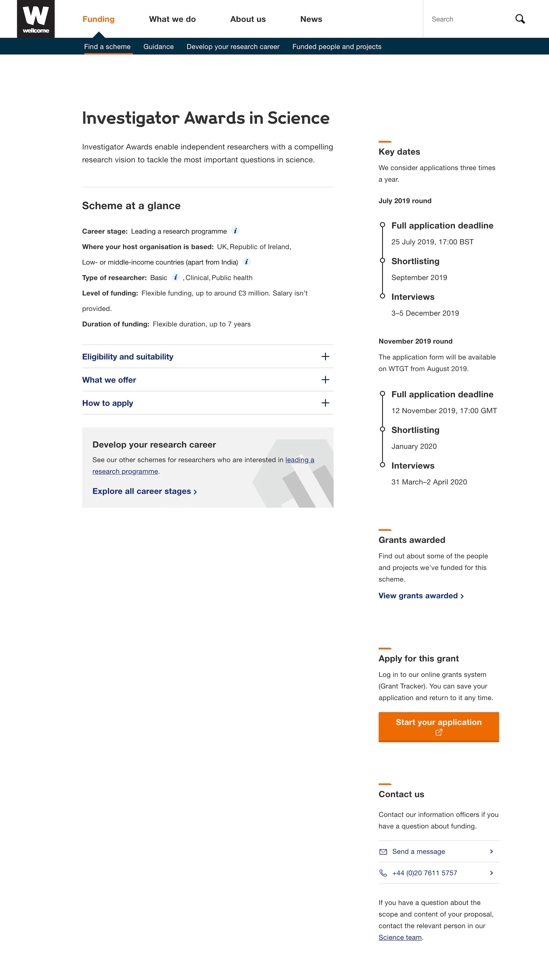
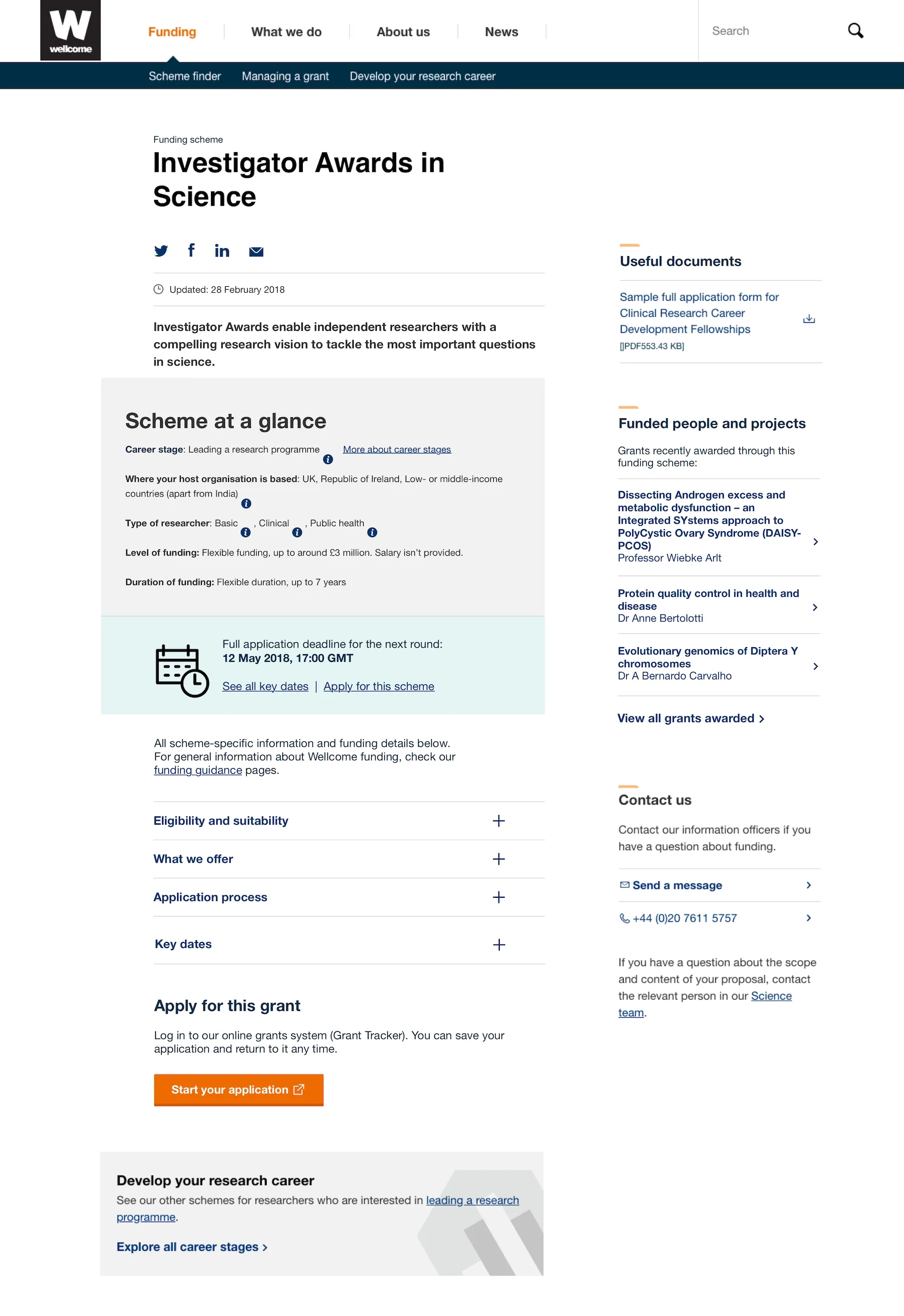
The scheme description page is the one-stop-shop for preparing a funding application. Despite its simple look, it is packed with information. Most of it lives in collapsibles hidden from initial view.
Despite generally very positive user feedback to this page, we identified a couple of issues. For example, the link to descriptions of related funded projects (more about these below) was often overlooked. With just relatively simple modification to the promo on the right hand side, we increased click-through rates to the list of grant holders for this scheme by 20%.
Another issue is that the layout of the page feels unbalanced due to a very long right-hand side bar. Based on feedback from previous usability testing sessions, we prepared a mock up of a scheme description page that was designed to more quickly absorb key information and easily identify upcoming application closing deadlines.
Summaries of funded projects useful for applicants
The chunkiest project I led during my time with Wellcome was the integration of 3000 summaries of funded people and project that had to be migrated from largely unstructured copy to a search- and browse-friendly, future-proof format.
Learning about funded people and projects is of immense value to grant applicants. They want to know about projects that Wellcome has been willing to fund, learn about the caliber of people they are competing with, and they are keen to find people around that they might be able to contact for advice. All this can help them to write a more successful application.
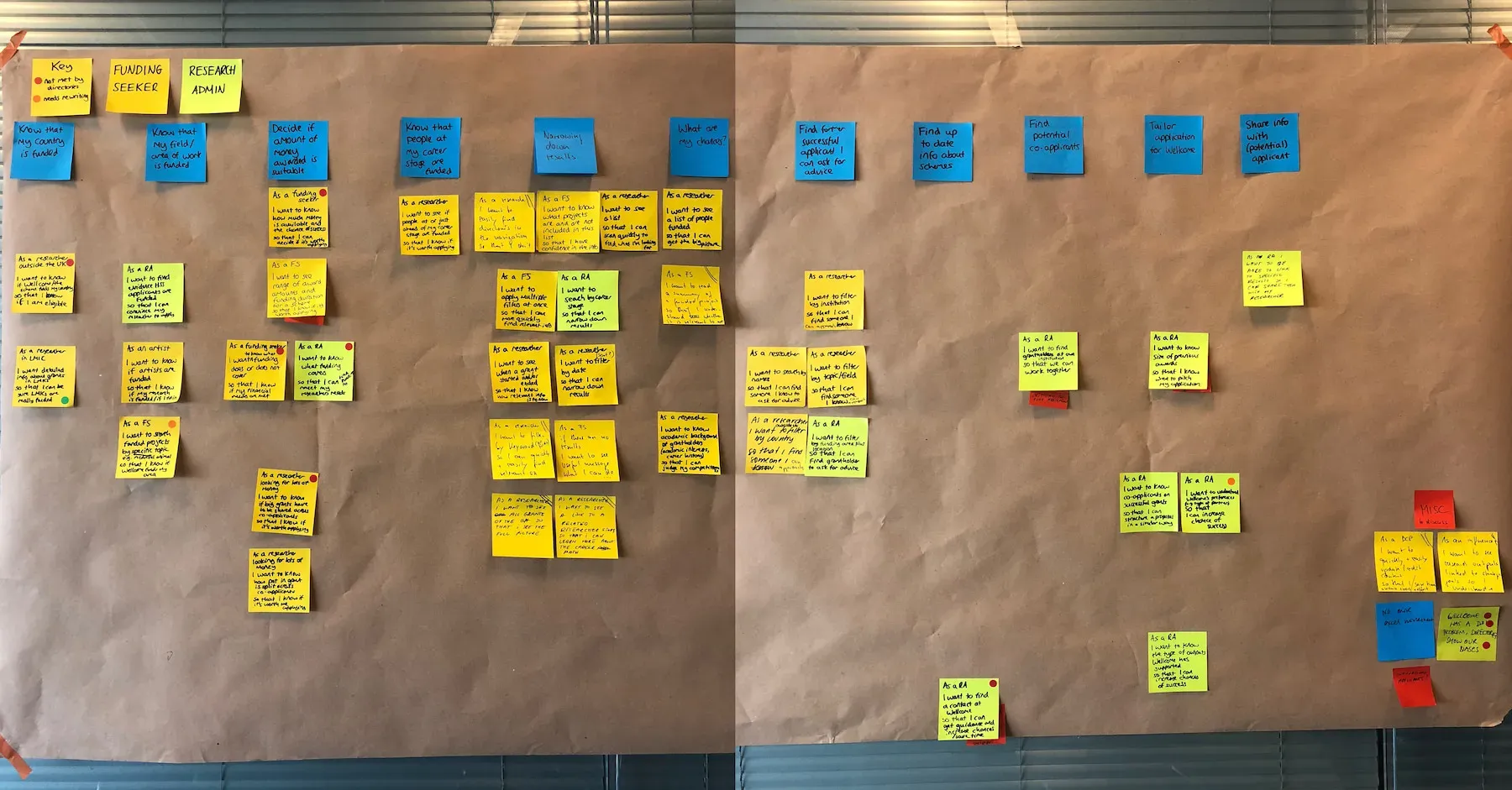
What initially might sound like a pure technical exercise was actually at the very heart of our product vision and we made sure the outcome would meet the needs of funding seekers. To find out what the process of applying for funding typically looks like, we created a user story map. We interviewed dozens of funding seekers and their proxies (academic research administrators) in order to understand how applying for funding unfolds and to identify points on that journey at which information about funded people and projects can be helpful. A user story map is particularly helpful when it comes to prioritising features of an MVP version that is true to its name and actually delivers value for users.
Domain model of a Schemes, Grants, projects, and Grant holders
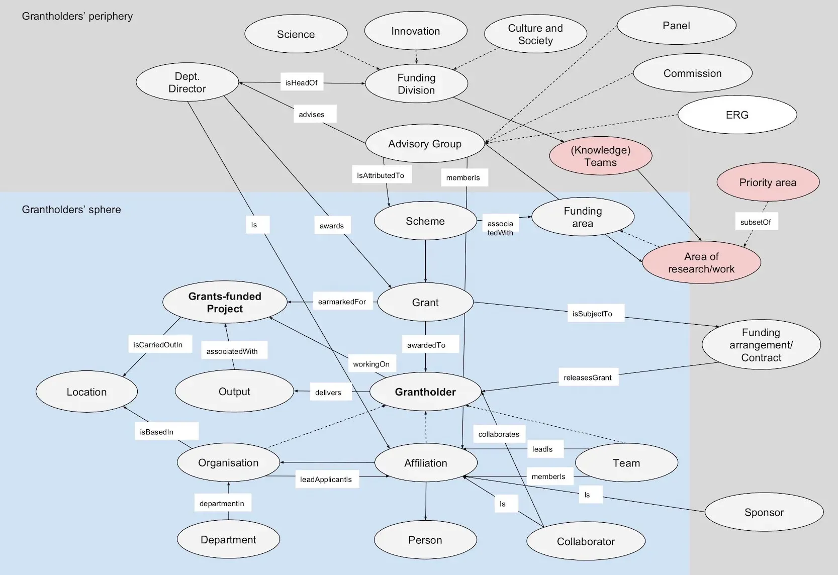
The system of giving out grants is hugely complex and frankly quite messy for anyone who doesn’t engage on a day-to-day basis. The term ‘grantholder’ is an umbrella that covers different types of funding recipients, funding areas, geographic locations, and other criteria. In order to build a directory of funded people and projects, we needed to arrive at a shared understanding and vocabulary of what exactly a grantholder is, what information we can publish (or do not want to publish) and what connects one grantholder with another grantholder.
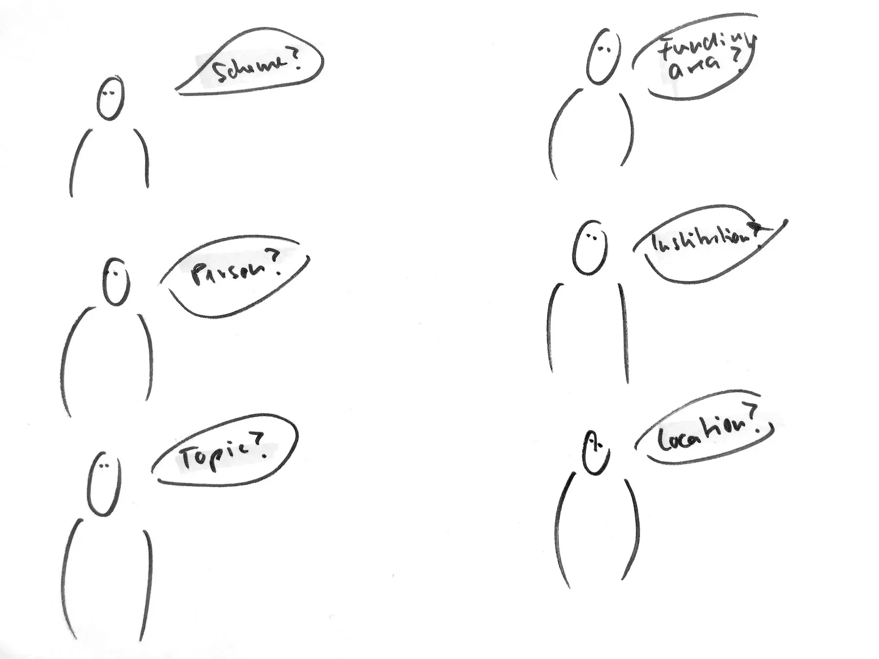
I spoke to a number of colleagues from the Grants team, sketched out their views and comments in simple diagrams, discussed visual notes from other interviews and eventually collated everything together in a so called domain model. It is a diagram that captures how concepts of schemes, grants, grantholders, and projects hang together. It was later used as reference for a future-proof and scalable data architecture of the directory of project summaries.
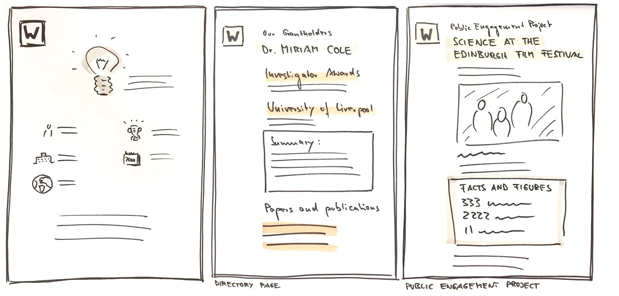
Equipped with a user story map and a domain model for the technical architecture, I started sketching out UI ideas around key questions that funding seekers have when reading about successful grantholders. Some sketched page wireframes facilitated discussions within and outside our team before I then built a klickable Axure prototype to be used in usability testing sessions.
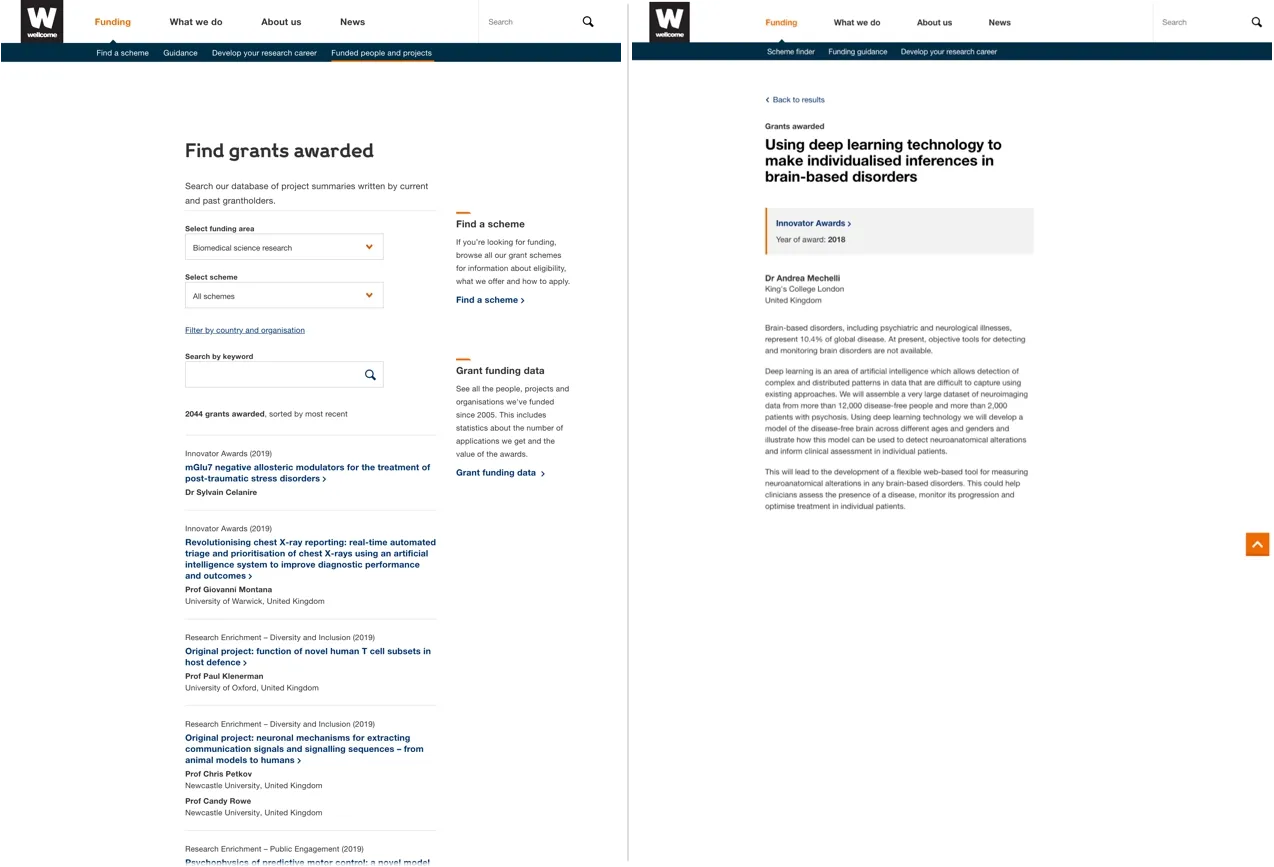
After a series of tweaks and iterations following two rounds of usability testing we launched the first wave of project summaries in January 2019 and completed build work of all 3000 pages in March 2019. Obviously, there is still a lot of work to be done. Some information that users have been asking for (e.g. funding amount and funding duration) is not part of this first iteration. It is not yet possible to browse topic-related projects across schemes and funding areas. But the groundwork has been laid to further iterate a user-centred product with relatively little additional build effort.
Introducing researcher stories
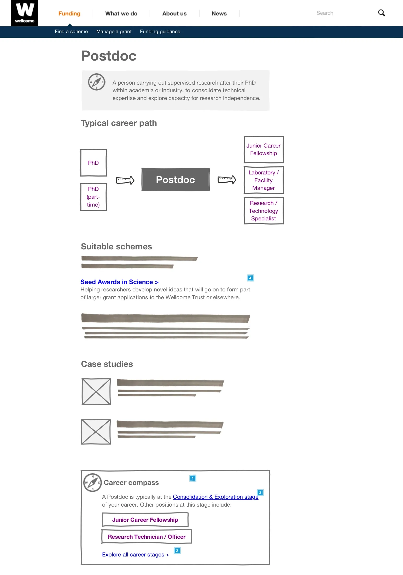
In order to attract people from a diverse set of backgrounds and locations, Wellcome decided to actively encourage and inspire people to either embark on or continue their research career. We introduced researcher stories: long-form articles that feature individuals who have managed to build a career in research despite individual challenges or systemic hurdles. Researcher stories were to complement a newly introduced career development section that aims to guide applicants to suitable funding opportunities according to where they are in their career.
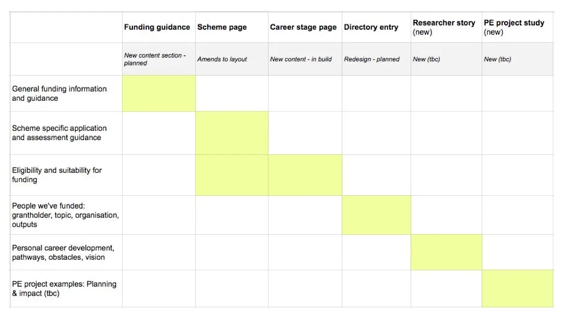
Content map
There are many places on the site where people can find information about other researchers. In most cases applicants use this information to establish eligibility and suitability for funding or learning about the technicalities of the application process. We identified an opportunity to go beyond delivering mere facts about funding and provide engaging content that reflects actual lives and struggles of researchers along their career path. Researcher stories focus on aspects of career development from an individual’s perspective, which is not covered by any of the other content pieces.
After very positive user feedback to the first story, we committed to producing a set of 2-3 stories for each of the four career stages. Each story was to cover at least one of the typical problems of researchers that appear to be in the way for progressing a career. The first story launched in April 2018. Analytics showed good engagement (page views, session duration, scroll depth) and feedback from users was very positive, but measuring actual impact of these stories with regards to diversifying the set of researchers proved to be much more challenging compared to other section of the site.