Telegraph: Responsive redesign of a desktop-first site
ux strategy information architecture navigation analytics
My role at Telegraph Media Group
In 2015, I was brought into the Telegraph UX team to help with delivering the responsive redesign and platform migration of Telegraph.co.uk by engaging as a UX lead in three different product teams over the course of one year.
”I hired Ulf for a two week contract and he was so great we kept finding him more work to do and he stayed for months. I really can’t recommend him highly enough. He delivered us a new IA for the site, a phenomenally complex piece of work with numerous extremely opinionated, vocal and conflicting stakeholders, and brought calm and consensus out of chaos. Next he delivered a strategy, structure and design for a completely new video platform, and finally he delivered a complex transactional and content led site for telegraph money.
Each was a very different piece of work, each was delivered superbly with an air of calm good humour and with many delighted stakeholders.”
Making top navigation work for people and business
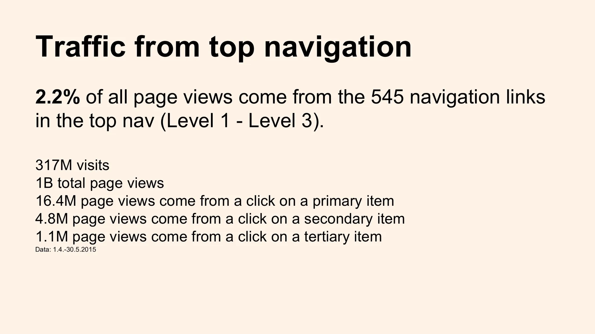
I was briefed to find a solution for the information design of the top navigation. Over time, the top nav had organically grown into a big jumble of categories and topics for all sorts of reasons, but mainly because up to the responsive redesign of the site, nobody was in charge of ‘grooming’ it and making sure it sufficiently addresses reader and business needs. This was to the effect that only very little traffic, 2.2% of all page views, actually started with a click on one of the 545 navigation items.
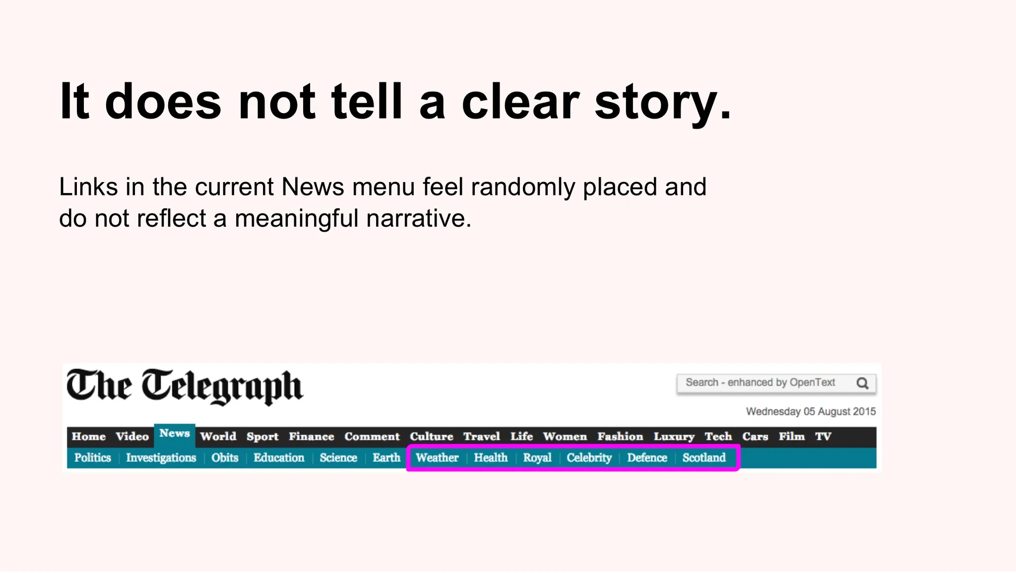
An initial evaluation brought a number of issues to light that can have a detrimental impact on the usefulness of the top navigation, e.g. that on cascading nav levels the old navigation menu disrespected the basic principle of parent-child relationships. Or: the items in the menu don’t tell a clear story, they confuse users.
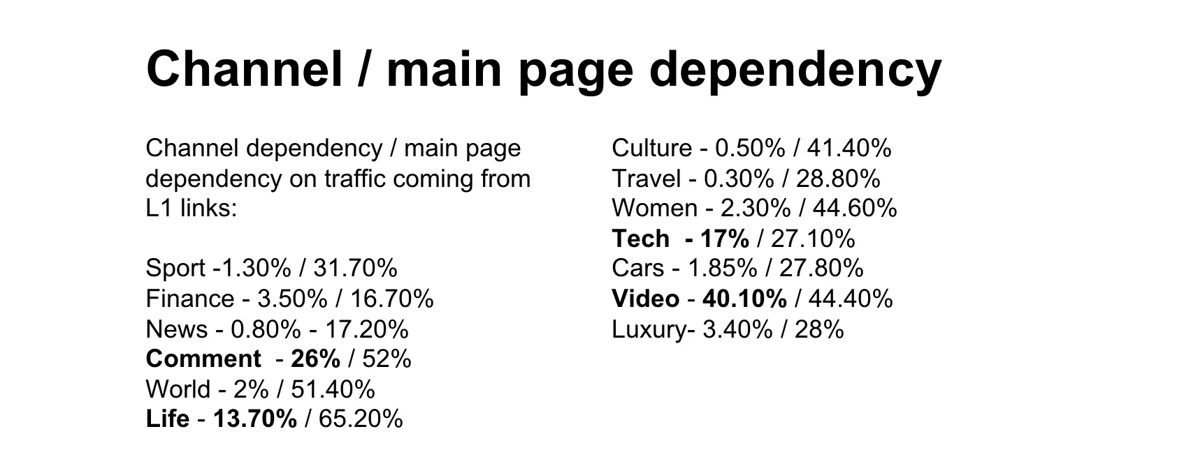
I then evaluated analytics of content, traffic and user journeys, and I surveyed readers about how they use the Telegraph navigation. This revealed some interesting insight, for example that some Top nav items like ‘Comment’ or ‘Video’have relatively few overall clicks, but traffic to and within these categories depends much more on the Top nav item as compared to e.g. ‘News’.
Based on the findings from users, analytics, stakeholders, and with best practise principles in mind, I proposed a model with a maximum of 10 top level categories that could accommodate a number of static and dynamic (seasonal or commercial) subsections / links. The proposal was iterated in a range of workshops with key stakeholders and tested with users in lab interviews.
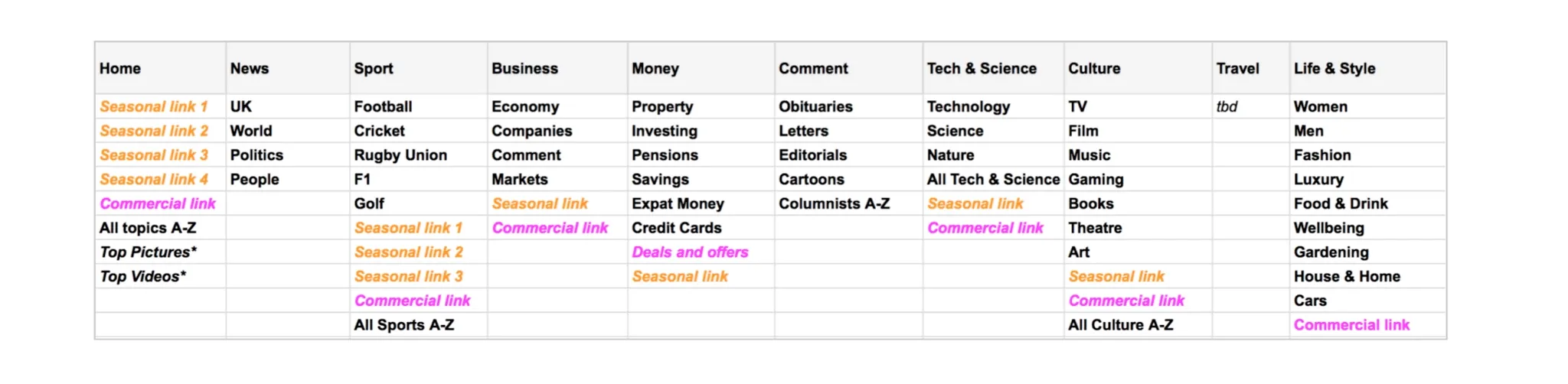
The final proposal was then tested in a treejack study, in which 900 Telegraph readers associated article headlines with a category that they think it should live in. This exercise validated most of the design decisions, but it also pointed to a few problematic categories such as ‘Obituaries’ and ‘Life & Style’. After a few tweaks, the new navigation was launched in 2016.
Making the Telegraph a go-to destination for video content
In autumn 2015, The Telegraph decided to build a new portal dedicated to browsing and viewing short-form videos with pre-dominantly in-house produced content series in channels such as Travel, Finance, and Lifestyle.
As UX lead I was tasked to establish the information architecture and the UI for this platform that was meant to have its own environment, separate from the main editorial news site.
At that point in time, video platforms of digital news sites were not common in the UK but there were a few examples to review from other global sites such as The Washington Post or the South China Morning Post.
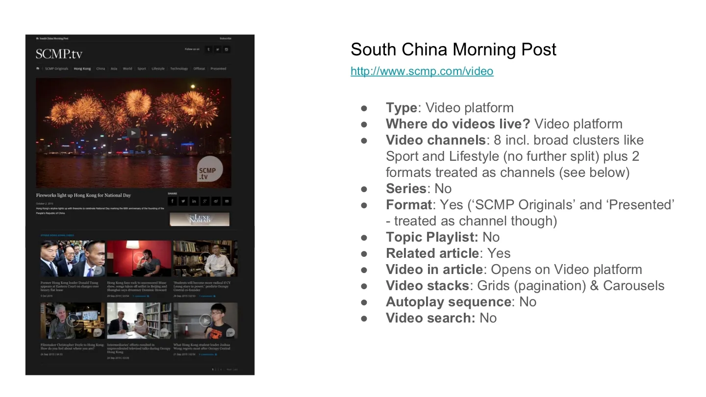
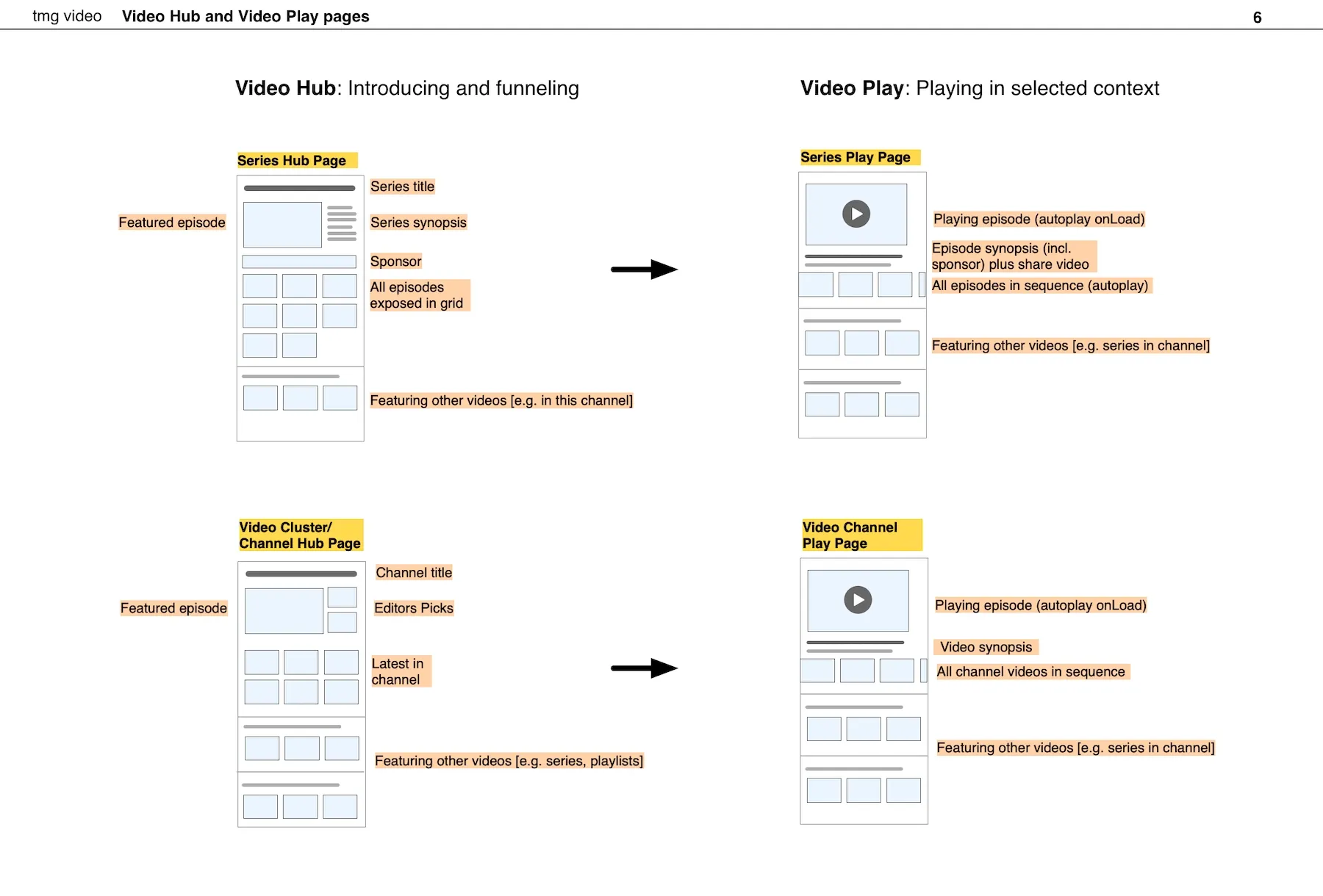
In a number of workshops with Ben Sinden (Director of Video at the time) and the Video team, we reviewed the planned content and two different clusters that would pre-structure the experience:
- Videos associated with a channel (such as Culture) but otherwise are not immediately related with each other, and
- Videos that are part of a whole series (e.g. The Science of skincare). A series can live in a channel.
Business objective was to maximise the length of viewing sessions, so we introduced the concept of playlists that automatically load a related video when the current one was finished, either from the same series or the same channel. To determine the exact logic of ‘next video’ was part of my work.
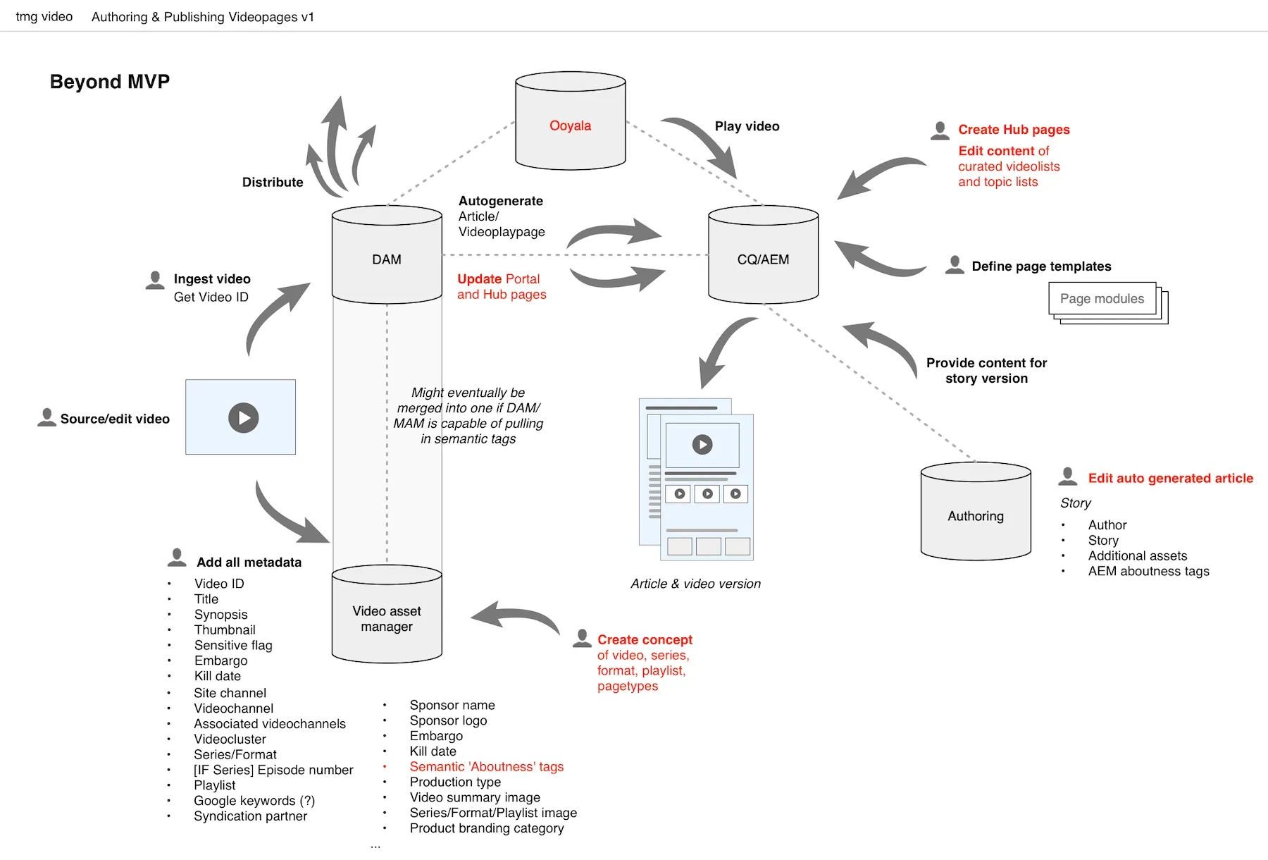
There were two key challenges to this project. One was to come up with a user-friendly environment that was seamlessly integrated into the Telegraph site but had its own navigation and a video-friendly interface. The second challenge was more a technical one, but it had potentially a big implication for SEO: how to do a purpose-built solution without duplicating content, because most of the videos were also to be featured in actual news or other articles on the site.
After having found a solution for the technical challenges, we focussed on defining the IA and navigation structure for the video hub and designing the actual user interface. Key premise was to provide the best possible viewing experience without sacrificing usability or user control.
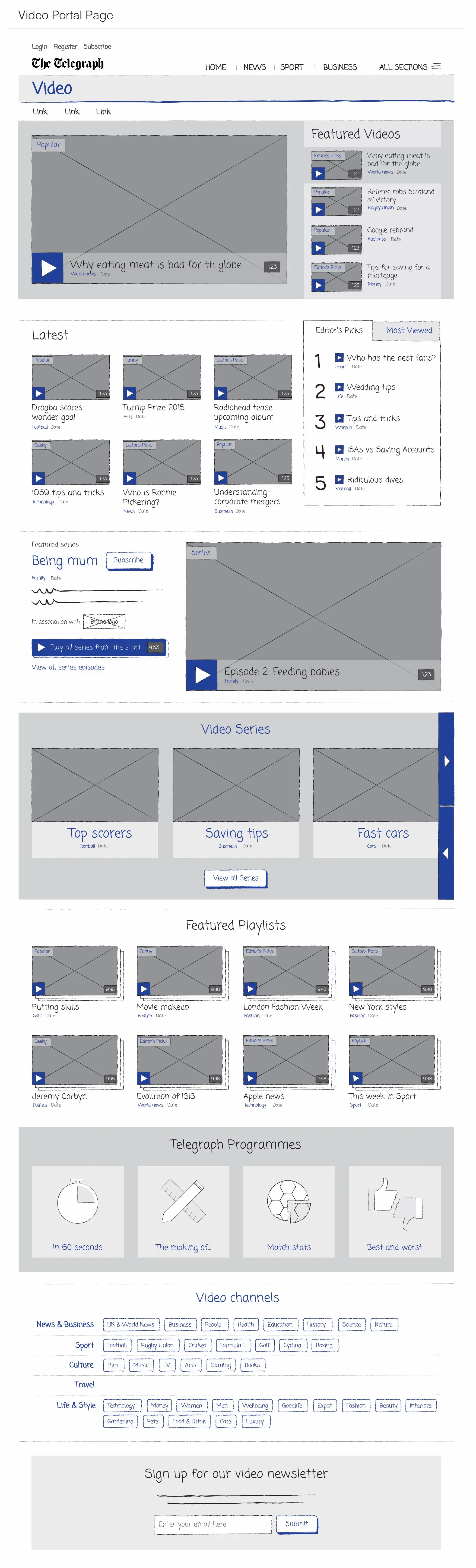
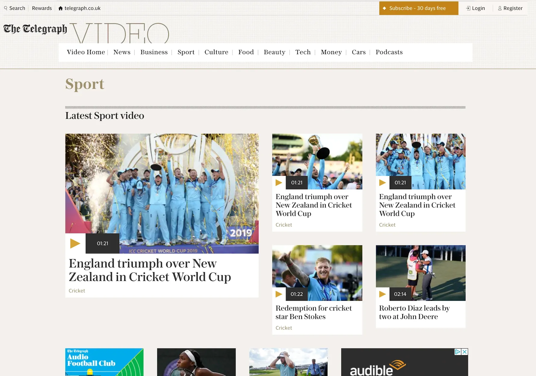
The design work was validated in a series of usability testing sessions and went live in February 2016 as the first video hub of a UK newspaper.
Making Financial Services useful on a news site
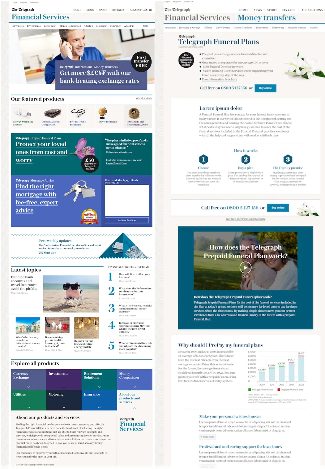
I was tasked to lead the Web optimisation work for Telegraph Financial Services, which is a number of financial products that the Telegraph sells as an intermediary to its readers.
Our team (UX, UI, developer, optimisation professional, and support from a user researcher) developed a design framework and an initial set of 12 product pages plus a hub page for Telegraph Financial Services.
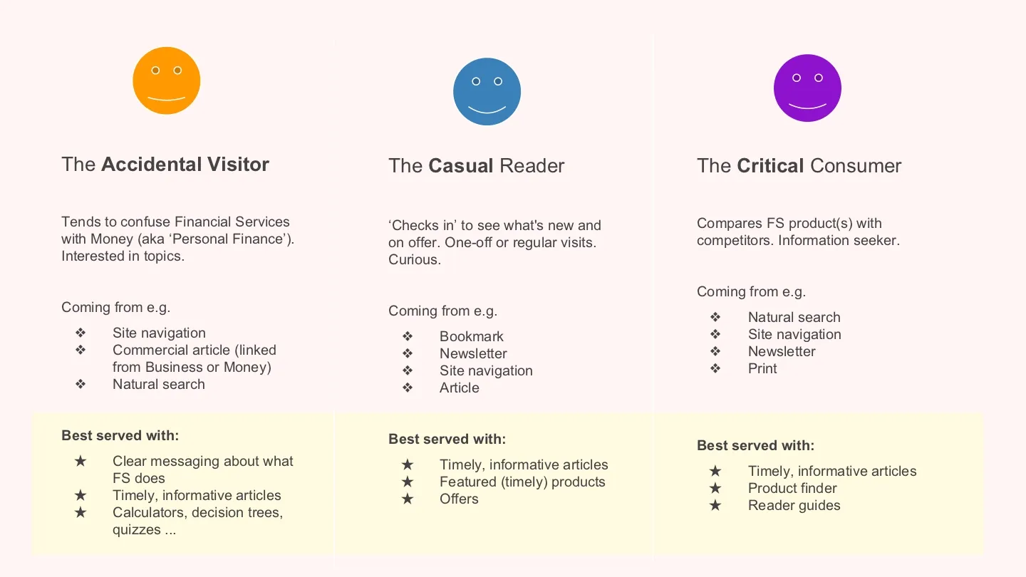
A previously carried out research had identified gaps and opportunities in the Financial Services section and provided us with a set of personas that the Financial Services team wanted to target. The personas however were far too diversified in order to work as design tools, so we grouped them into three behavioural clusters of site visitors, each with different motivations and interests when arriving on FS product pages and each with set of design features that they could be best served with. We were able to validate these clusters in a number of focus groups, in which we explored triggers and blockers for buying financial products through a news site.
The actual design work started with a content and functional review of the 12 products in order to determine commonalities. Rather than building 12 bespoke product pages, we aimed to create a single template that would be adapted to each product’s unique selling proposition. This approach would help to strengthen the brand and build trust into the Telegraph as an intermediary for financial products. On a technical level, it would allow for various rounds of A/B testing to establish type and configuration of content modules that drive the highest conversion for each product.
Although modules on a page could be customised (or omitted if not applicable), the page would still follow the same narrative arc:
- The top section of the page would always introduce the proposition in a nutshell (‘At a glance’) and key CTAs.
- A value statement that outlines customer benefits and mechanics of the proposition in a 1-2-3 format (‘Why and How?’) would typically sit just below the introductory panel.
- A number of other modules would follow, e.g. engagement drivers; links to related articles; product features long-list; customer testimonials; FAQs; and repeated CTA panels across the page.
- The page would conclude either with CTA’s for this product, or, if applicable, with a sign-up / registration form. Anchor links to this form were provided throughout the page.
Apologies for the very long wireframe below. I think it’s useful to see it in its full length.

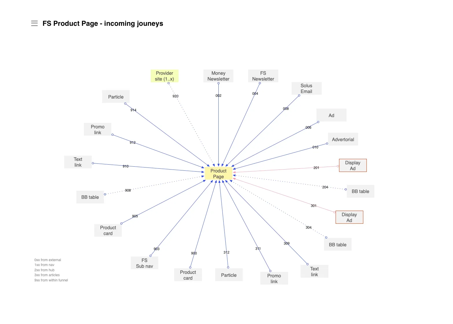
Increasing traffic to product pages was key to the optimisation work. We wanted to increase overall conversion and we needed sufficient traffic to carry out experiments. We identified 20 different acquisition points on the Telegraph site and external prompts. The identification of acquisition points allowed for more optimisation experiments, e.g. users coming from a Money newsletter (matching the ‘Critical consumer’ cluster) could be served with a variant that was more information-driven, whereas ‘Accidental visitors’ coming from Google might be better welcomed with an actionable tool like a calculator.
The pages for all products were launched subsequently, each accompanied with related articles and what we called ‘utility pages’, e.g. product comparisons, terms and conditions etc
The product page template proved to be a robust solution that was flexible enough to accommodate for each product’s idiosyncrasies and optimisation tweaks without sacrificing the narrative of the page, the consistency of the brand, and overall usefulness of information. Optimisation experiments were still ongoing when I left the Telegraph in September 2016.